An intro to UX psychology and how it helps in users decision making
By- Ayush Bajpai


Photo by Charles Deluvio on Unsplash
Table of contents
How people see
Vision trumps all the senses. Half of the brain's resources are dedicated to seeing and interpreting what we see. What our eyes physically perceive is only one part of the story. The images coming into our brains are changed and interpreted. It's really our brains that are "seeing."
What you see isn't what your brain gets You think that as you're walking around looking at the world, your eyes are sending information to your brain, which processes it and gives you a realistic experience of "what's out there." But the truth is that what your brain comes up with, isn't exactly what your eyes are seeing. Your brain is constantly interpreting everything you see. Take a look at this figure, for example.

What do you see? At first, you probably see a triangle with a black border in the background and an upside-down white triangle on top of it. Of course, that's not really what's there, is it? In reality, there are merely lines and partial circles. Your brain creates the shape of an upside-down triangle out of empty space because that's what it expects to see. This particular illusion is called a Kanizsa triangle, named for the Italian psychologist Gaetano Kanizsa, who developed it in 1955. Now, look at the Figure next to the first one, which creates a similar illusion with a rectangle.
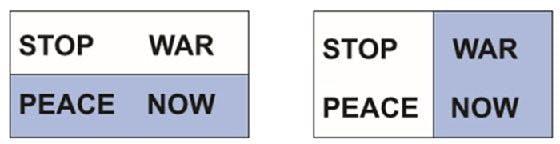
The brain creates shortcuts Your brain creates these shortcuts in order to quickly make sense out of the world around you. Your brain receives millions of sensory inputs every second (the estimate is 40 million), and it's trying to make sense of all of that input. It uses rules of thumb, based on past experiences, to make guesses about what you see. Most of the time that works, but sometimes it causes errors. You can influence what people see, or think they see, by the use of shapes and colors. The following figure shows how color can draw attention to one message over another.
If you need to see in the dark, don't look straight ahead The eye has 7 million cones that are sensitive to bright light and 125 million rods that are sensitive to low light. The cones are in the fovea (central area of vision), and the rods are less central. So if you're in low light, you'll see better if you don't look right at the area you're trying to see.
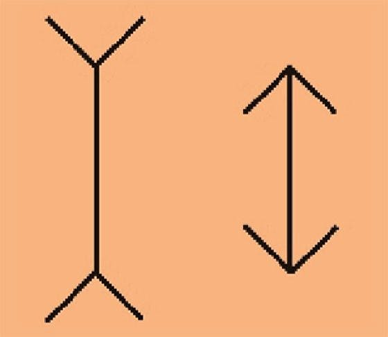
Optical illusions show us the errors Optical illusions are examples of how the brain misinterprets what the eyes see. For example, in the Figure below, the line on the left looks longer than the line on the right, but they're actually the same length. Named for Franz Müller-Lyer, who created it in 1889, this is one of the oldest optical illusions.
We see in 2D, not 3D Light rays enter the eye through the cornea and lens. The lens focuses an image on the retina. On the retina, it is always a two-dimensional representation, even if it is a three-dimensional object. This image is sent to the visual cortex in the brain, and that's where recognition of patterns takes place - for example, "Oh, I recognize that as a door." The visual cortex turns the 2D image into a 3D representation. Takeaways
What you think people are going to see when you design a product may or may not be what they actually see. What people see might depend on their background, knowledge, familiarity with what they are looking at, and expectations. You might be able to persuade people to see things in a certain way, depending on how you present information and visual elements. You can use shading or colors to make it look like some things go together and others don't.
# What Motivates Behavior Change? #
Let's say you want to create a website or app to help people exercise more, but you are not sure how to motivate users. In psychology, we distinguish between extrinsic and intrinsic motivation. This means that someone can be driven to do something either by external factors, like the prospect of receiving a reward, such as money or by internal factors, like the enjoyment derived from doing an activity. A website or app that encourages people to exercise more might offer a reward whenever a user exercises, thus creating extrinsic motivation for the person to show that behavior. The Pact app runs with this idea by allowing users to earn money by reaching their health goals. Research has shown that this approach works well for people who do not enjoy the behavior (for example, people who don't enjoy exercising). However, for people who do enjoy the behavior but would like to improve on it or are not doing it for another reason, giving a reward could actually have a negative effect. Rewarding someone for an activity they already inherently enjoy might lead to a short-term increase in this behavior, but as soon as the reward is taken away, the activity is often pursued less than before the reward was given. This phenomenon is called the "over-justification effect", because the existing reason for a person to do something, such as enjoyment of exercise, is suddenly joined by another reason, the external reward. Because rewards are a powerful way to get people to change behavior in the short term, including them is tempting. The website Freeletics, which promotes high-intensity workouts to increase fitness levels, has a popular workaround for the problem of over-justification. The workouts require a basic level of fitness to be completed; therefore, we can assume that users already get some enjoyment out of exercising (otherwise, they probably wouldn't have achieved a basic level of fitness). The website still uses extrinsic rewards in the form of stars for completing workouts, but users receive a star only if they perform all exercises in a workout by exactly following a predefined series of actions. So, the reward, in this case, is linked to performance; the user has to not merely perform the activity but do it well in order to receive the reward. This type of reward has been shown to be very effective and not as prone to the over-justification effect.
#4 psychology principles every UX/UI designer should know#
When designing a product, it's important to know what type of response you want to elicit from your users. Understanding psychology principles can influence human behavior and create a more seamless experience for your users.
1. Hick's Law
The time it takes to make a decision increases with the number and complexity of choices.
This is perhaps one of the most straightforward psychological principles to grasp, yet one of the most important. When the user is given more choices, it requires them to think longer and increases the time it takes to make a decision. If the individual is overwhelmed with options, then they may resort to choosing nothing at all. However, as a UX Designer, it is your job to ensure this doesn't happen. Often, there is too much functionality crammed into a site, while the burden it places on the user is largely ignored. You can't always eliminate all of the choices, but it is your job to breakdown the process and make the information easier to digest. One way to mitigate this issue is by chunking complex items into smaller steps. For example, in a Navigation menu, you can group similar items under the same category. Spotify is an example of a company that does a good job of decreasing decision-time for their users. Imagine being presented with every single song when you open your Spotify app. It would be incredibly overwhelming to choose a song, and not to mention, extremely time-consuming to sift through every option. However, Spotify does a great job of categorizing the "Browse" tab into various buckets.

The page is broken down by genres and distinct musical categories, which are then further divided into more specific groups. Even though Spotify is providing several songs to choose from, you never feel totally overwhelmed because the clear hierarchy and levels of separation. It is a logical and coherent experience clicking through the different buckets, which cuts down the time the user would take making a decision. When designing a website, app, or any product, it's important to keep in mind how you are presenting options to your user. Ask yourself - is there is a way to strip it back to the essentials and create a less complex experience?
2. Cognitive Load
The total amount of mental effort being used in a person's working memory.
Specifically, in UX, cognitive load refers to the amount of mental resources that is required to operate a user interface. Similar to computers, our brains have limited capabilities when it comes to processing power. If you bombard users with information, their performance will likely suffer. Individuals may feel overwhelmed, confused, and ultimately abandon the task or site. In UX Design, the most relevant types of cognitive load are Intrinsic and Extraneous. Intrinsic cognitive load: the difficulty associated with a specific instructional topic This explains why copy is such a crucial part of the experience. Copy can make or break a design. The text needs to be concise, simple, and clearly stated. Using ambiguous language will make the experience confusing and difficult to navigate. It should be easy and effortless for users to follow the instructions or perform a task. You can't eliminate cognitive load completely, and you wouldn't want to either because users come to a website in order to get information. You can, however, decrease or try to eliminate extraneous cognitive load. Extraneous cognitive load: processing that takes up mental resources, but doesn't actually help users understand the content An example of this is when websites use multiple font sizes and weights, but they don't each convey different meanings. There are tactics that can help diminish extraneous cognitive load and create a more enjoyable experience for your user.
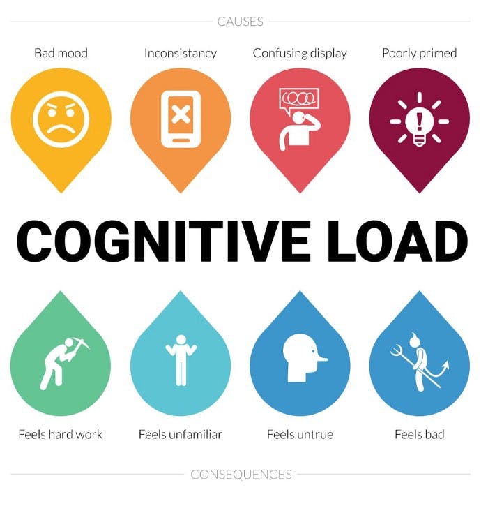
First, avoid visual clutter on the site or app. This includes elements such as, irrelevant images, redundant links, meaningless typography/graphic elements that are distracting. When used properly, links, imagery and typography are critical to a website, but when overused they can become a pain point. Mis-use of these design elements can impair usability and readability of the site. Another method to get rid of extraneous cognitive load is to keep in mind the user's existing mental models and to build on them. Based on past experiences, People have schemas and mental models regarding how websites work. If you use familiar layouts and elements on your site, then you will decrease the amount of learning the user has to do.
3. Von Restorff Effect
Also known as The Isolation Effect, predicts that when multiple similar objects are present, the one that differs from the rest is most likely to be remembered. This principle explains why you want to make important actions distinct from other elements on the page. For example, CTAs should look different from the rest of the site. You want to make it easy for users to distinguish between other items and the primary CTA. You can make an element visually distinctive by changing size, shape, color, padding, etc. An example of this is when websites display subscription models or pricing. DropBox Business does a nice job of showcasing the most valuable pricing option to the user. The design changes are subtle, such as a dark-blue CTA, compared to a white CTA on the other options.
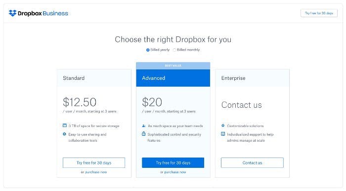
The entire box is also highlighted with a light-blue background and darker blue on the header. You will also notice the "Best Value" flag displayed at the top. While none of these design choices are bold or distracting, they do clearly show the most logical choice for the user. This option will probably be seen first and remembered the best out of all three choices. 4. Serial Position Effect
Users have a propensity to best remember the first and last items in a series.
Serial Position Effect involves two main concepts: The Primacy Effect: Items that are presented at the beginning of a list are recalled with greater accuracy than items in the middle of a list. The Recency Effect: Items that appear at the end of a list are also more likely to elicit better recall than items presented in the middle of a list. With these two ideas in mind, you can apply these concepts to your designs. One way to do this is to limit the amount of recall required. The human short-term memory can only maintain around 5 items at a time. Therefore, you should make sure users are given less than 5 items at a time. This will increase the likelihood that the most relevant information is retained.
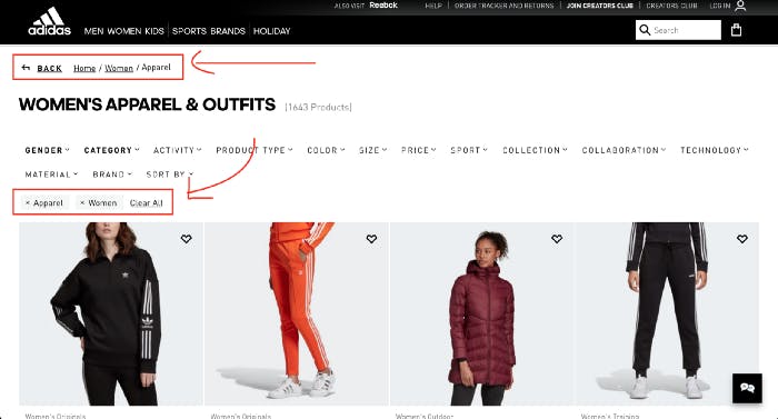
Adidas online shopping experience provides breadcrumbs and a filter to decrease the amount of information the user has to memorize. Adidas does a nice job of executing this by providing all the filters that are applied when a user is browsing clothing. They take it one step further and provide breadcrumbs at the top of the page, so a user never has to remember where they are in the experience or the route they took to get there.
Key Takeaways
There are several psychology principles that apply to the field of UX Design. Most of these are fairly straightforward and you may already be applying them to your designs without even knowing it. However, the reason it's important to understand these ideas is so you can explain the meaning behind your designs, especially when presenting to stakeholders. It is also essential that you understand how a user feels and why they act a certain way. This will give reasoning and substance to your designs and ensure you are producing a valuable experience for your user.