Elevating User Engagement through Enhanced UX in Jupiter App
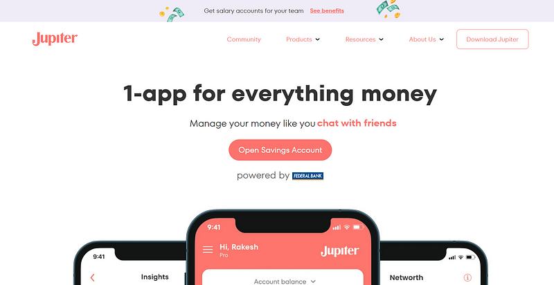
Jupiter Money, the 1-app for everything money!
Introduction
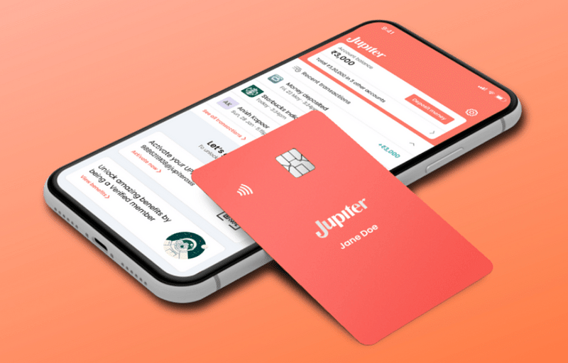
Open a zero balance savings account online(Savings Account is opened with Federal Bank). Jupiter brings you instant account opening with zero balance in 3 minutes. Jupiter is the easiest, personalised money management app that helps you take control of your finances. Track spends, pay bills, save for goals, and invest & grow your money!
With offerings like these, users might be enticed by the app. However, the crucial question lingers: does it genuinely accomplish its intended objectives and uphold its commitments? The responses to these inquiries will reveal themselves as we delve deeper. To begin our exploration, let’s first highlight what Jupiter is excelling at:
But maybe we should start from the beginning…
Introduction
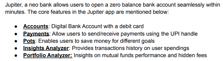
Jupiter is a mobile application designed to assist users in budgeting and financial planning. By enabling users to link their bank and credit card accounts, the app consolidates all financial information into a single platform. Through automatic transaction categorization, Jupiter provides a comprehensive overview of users’ spending patterns, facilitating the identification of potential areas of overspending.
The app empowers users to establish budgets for various spending categories and receive timely alerts when nearing or surpassing budget limits. In addition to budget management, Jupiter allows users to monitor their net worth, set financial goals, and track progress toward those objectives. Personalized insights and money-saving tips are also offered to guide users in making informed financial decisions.
Jupiter proves to be an invaluable tool for individuals seeking a deeper understanding of their spending habits, offering opportunities to save money, reduce debt, and plan for a more secure financial future.
Through thorough research, collaborative endeavors, and an unwavering commitment to user satisfaction, I revolutionized the user experience of the Jupiter app. This strategic effort not only enhances the app’s interface but also positions it for significant strides in the competitive landscape of financial applications. Come with me as we delve into the journey of refining Jupiter’s user interface, exploring how the synergy of data, design, and dedication has propelled the user experience to unparalleled levels of excellence.
The Problem
A user browses through various financial management apps and decides to explore the Jupiter app for its promising features. 📱
An enticing Jupiter Pro subscription ad captures the user’s attention, prompting them to click and explore more. 💡
Upon clicking the ad, the user is redirected to Jupiter’s main dashboard, where a limited set of financial insights is displayed repetitively. 🔄
The user attempts to delve into specific financial categories but encounters frustration as the interface does not respond seamlessly to their actions. 🧐
In the pursuit of optimizing their investment portfolio, the user initiates a search for detailed mutual fund insights, only to be met with irrelevant and confusing results. 🤦♂️
Feeling disheartened by the lack of clarity and comprehensive financial analysis, the user grows disappointed with the overall experience on the Jupiter app. 💔
Subsequently, they opt to explore alternative financial apps that offer a more user-friendly and insightful interface for their financial planning needs. 🌐
Okay…but how did we get there?
To comprehend the roots of the UX challenges faced by Jupiter app, a thorough analysis was conducted. Exploring diverse data sources such as support tickets, research interviews, and extensive data analytics, our objective was to unveil the core reasons behind the identified issues. The aim was to gather profound insights into user behavior and pain points, offering a comprehensive understanding of the challenges observed within the Jupiter app’s user experience.
Here is the glimpse of what we investigated:
We closely examined user behavior at different stages of the order process and got down to the following pain points:
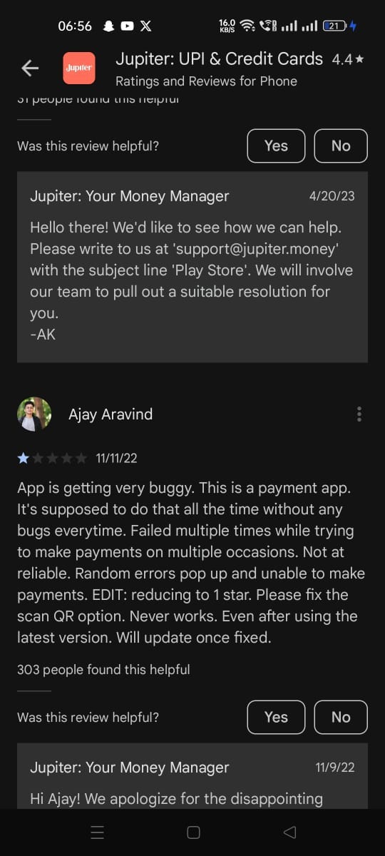
Primary focus of any finance app is to send and receive payments, and users find it difficult to receive payment due to the complex positioning of the qr code.
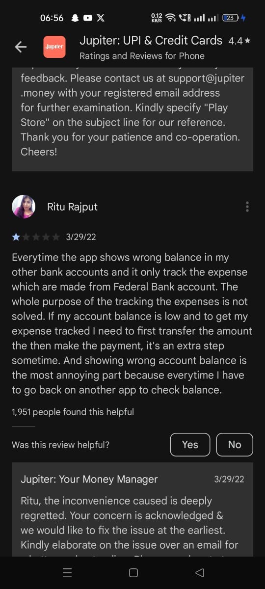
The existing net worth(total cash available across all my linked banks) displayed in the Jupiter app is not accurate and not able to use that figure for any purpose, moreover it primarily shows the balance in their own account primarily, if the person needs to get information on balance in other accounts, they need to follow a multi-step process to get to the balance from other banks, moreover the balance displayed is often not accurate and not updated.
Users are not able to find any valuable insights from the existing expense tracker other than just grouping expenses based on category.
After observing the thoughts, user anxieities and their behaviour, we identified the key points to be addressed
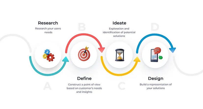
Design Process
Secondary Research

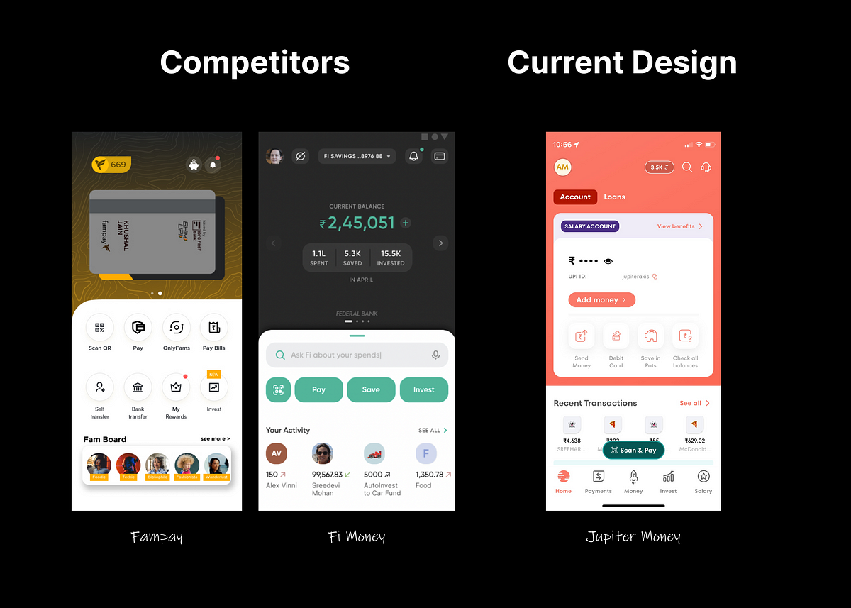
But is there nothing good with the app? Wrong!
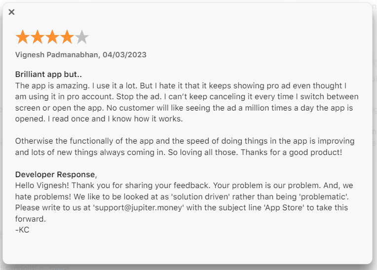
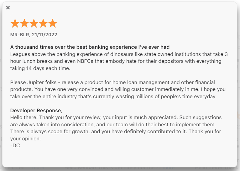
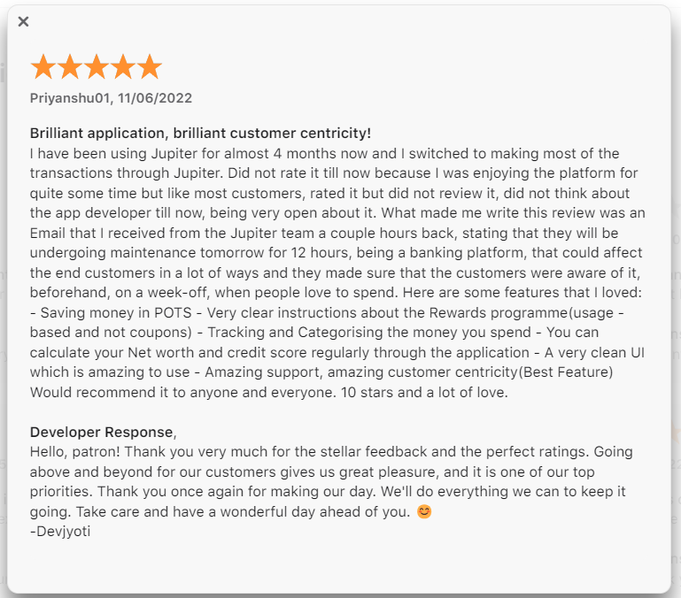
Analyzing these reviews provides a lucid understanding that, despite certain challenges, Jupiter has not fallen short in catering to user needs. The standout features, such as an exceptionally well-crafted UI, the innovative introduction of features like Pots, good customer support and the inclusive functionality of a super app, position Jupiter as an ideal choice for contemporary users seeking comprehensive financial management in one platform. Notably, the app has garnered praise for its outstanding customer support. The introduction of features like Jewels and goal-based investing has significantly appealed to users, further contributing to Jupiter’s positive reception in the market.
💎Jewels rewards
- On making spends through the Jupiter products such as Debit card or UPI, the user receives a reward of 1% in Jewels rewards which can be converted to real money at the rate of 1 Jewel reward = 1 Rupee
💸 Goal-based Investing (Feature — Pots)
Pot is a goal-based investing feature that allows the users to save money towards a goal and Jupiter converts it into an FD giving you higher returns than if the money were to be in a savings account
In addition to it the money is not available for the user to spend as it is being stored in a separate bucket apart from the savings account
This tackles the pain point where users open multiple bank accounts to save money and maintain separate accounts in order to keep it away from their spending account.
🌐Online Community and Forum
Elevating user engagement, Jupiter provides a dynamic online community and forum exclusively designed for individuals like yourself. This space serves as a nexus for insightful conversations, knowledge sharing, and mutual assistance. Immerse yourself in discussions, glean tips, and explore the vast array of possibilities within Jupiter. This collaborative platform not only connects you with a community of like-minded users but also amplifies your Jupiter experience through shared wisdom and collective expertise, making it an integral part of our user-centric approach.
User Persona:
Millenial Professionals
a. These are young working professionals of age group say 20–27
b. Mostly work in Corporates
c. Love Online Shopping, OTT Platforms
d. Lack Financial Independence
2. Mid-Level Professionals
a. These are mostly married working professionals of age group say 28–35
b. Work in corporates as well as take care of family and households
c. There is 1:1 ratio of who love online shopping and OTT, and not
d. Have achieved some level of financial independence but need to diversify the investments
Problems user face day-to day in app
Complex QR Code Positioning:
Issue: Users face difficulties in receiving payments due to the complex positioning of the QR code.
Impact: Hampers the primary function of sending and receiving payments, affecting user experience.
Inaccurate Net Worth Display:
Issue: The displayed net worth, representing total cash across linked banks, lacks accuracy and primarily focuses on the user’s account.
Impact: Users encounter challenges in obtaining accurate and comprehensive financial snapshots, impacting decision-making.
Limited Insights from Expense Tracker:
Issue: Users struggle to extract valuable insights from the existing expense tracker, which offers only basic grouping of expenses based on categories.
Impact: The expense tracking feature falls short in providing meaningful insights, limiting users’ understanding of their spending patterns.
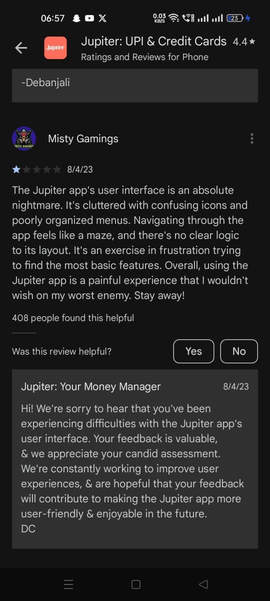
User Interface Responsiveness:
Issue: Users face confusion as the cursor does not respond seamlessly while exploring product categories, leading to a less intuitive navigation experience.
Impact: Hinders the user’s ability to efficiently explore and interact with the app, affecting overall satisfaction.
Proposed solution based on the research:
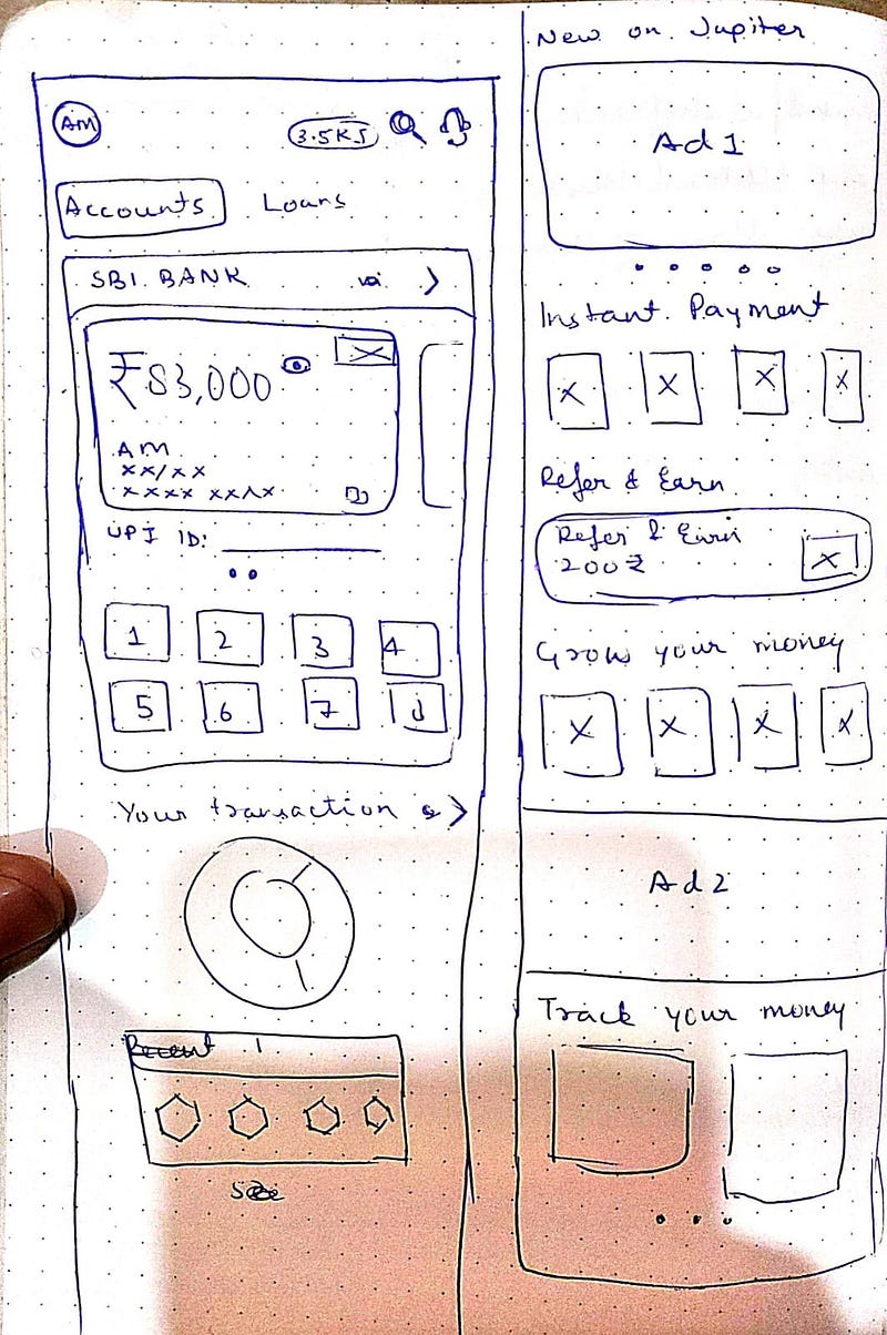
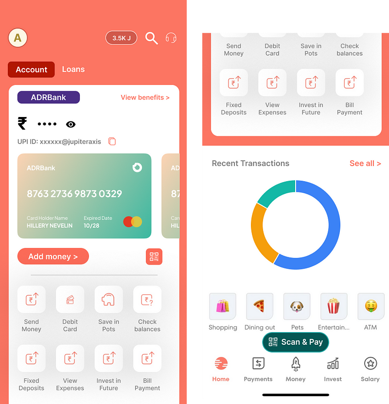
Streamlining Banking Access with Intuitive Swiping:
To tackle the challenge of complex navigation and multi-step processes, a user-centric solution has been introduced. Now, users can seamlessly switch between their linked banks with just one effortless swipe. This innovative feature simplifies the viewing of different bank cards, offering a quick glance at crucial details such as balance, CVV, and more. By minimizing the steps required to access essential banking information, this enhancement significantly enhances user convenience and efficiency.
Centralized Dashboard for Instant Access:
Addressing the need for a more user-friendly interface, a strategic modification involves consolidating all vital features directly onto the homepage dashboard. This comprehensive approach saves users valuable time and eliminates the frustration associated with searching for specific actions within the app. Now, users can effortlessly locate and engage with essential functionalities, creating a more intuitive and satisfying user experience.
Transaction Overview at Your Fingertips:
Recognizing the significance of transaction management, a pivotal shift involves placing an overview of transactions directly on the home screen. This strategic placement aligns with the app’s unique selling proposition, allowing users to access all necessary transaction information at a glance. By bringing transaction details to the forefront, users can effortlessly track their financial activities, enhancing transparency and facilitating quick decision-making.
These thoughtful enhancements not only address identified pain points but also align with the app’s core strengths, ensuring a harmonious integration of user needs and the app’s unique features. This user-centric approach reflects a commitment to elevating the overall Jupiter app experience, making it more accessible, efficient, and delightful for every user.
Ways to measure its success-
User Engagement Metrics:
Active Users: Monitor the number of active users post-implementation to gauge sustained interest and engagement.
Session Duration: Track the average time users spend within the app to assess increased interaction.
Feature Adoption Rates: Analyze how quickly users adopt and utilize the newly introduced swiping, centralized dashboard, and transaction overview features.
Task Completion Rates:
Switching Banks: Measure the success of the swiping feature by analyzing how frequently users switch between their linked banks and perform transactions seamlessly.
Dashboard Interactions: Assess how often users engage with various features directly available on the homepage dashboard, indicating the effectiveness of centralization.
User Satisfaction Surveys:
Feedback Surveys: Conduct surveys to gather direct feedback on the new features. Ask users about their experience, ease of use, and perceived improvements.
Net Promoter Score (NPS): Gauge users’ likelihood to recommend the app to others, providing an overall measure of satisfaction.
Transaction Management Metrics:
Transaction Overview Usage: Track the frequency of users accessing the transaction overview on the home screen to ensure its relevance and utility.
Error Rates: Monitor transaction-related errors or issues to identify potential areas for improvement.
Operational Efficiency:
Support Tickets: Analyze changes in the volume and nature of support tickets related to navigation or feature usage post-implementation.
App Performance: Ensure the app’s performance metrics, such as loading times and responsiveness, align with or surpass pre-implementation benchmarks.
Community Feedback:
Forum Engagement: Monitor the Jupiter community forum for discussions related to the new features. Pay attention to community reactions, suggestions, and any reported issues.
Community Polls: Engage the community through polls to gather their sentiments about the swiping, centralized dashboard, and transaction overview features. This direct input provides insights into communal perceptions.
User Surveys:
Post-Implementation Surveys: Roll out surveys to existing users after the new features have been in use for a defined period. Inquire about their experiences, challenges faced, and overall satisfaction.
Feature-Specific Questions: Include questions specifically tailored to each new feature, asking users about the usability, perceived benefits, and any areas they believe need improvement.
Conversion Rates:
- Goal Completion: If users have specific financial goals within the app, measure the completion rates post-enhancements to ensure streamlined processes.
But what about other problems?
- The existing net worth feature in the Jupiter app, intended to showcase the total cash available across all linked banks, presents a significant challenge. Users often encounter inaccuracies in the displayed figure, rendering it unreliable for making informed financial decisions. Moreover, the displayed net worth primarily focuses on the user’s account, omitting a comprehensive overview of balances from other linked banks. This deficiency not only hampers the user’s ability to obtain accurate financial snapshots but also necessitates a convoluted, multi-step process to access balances from various banks.
- To address the issue of inaccurate net worth representation, Jupiter can implement a real-time data synchronization mechanism. By establishing direct connections with linked banks and financial institutions, the app can ensure that the displayed net worth is continuously updated. Additionally, incorporating advanced algorithms to aggregate and reconcile transaction data can enhance accuracy. Providing users with the option to manually refresh the net worth display can further empower them to access the latest financial information on-demand.
2. Users experiencing difficulty accessing the Jupiter app are greeted with a generic and uninformative error message merely stating “Sorry.” This vague error response fails to guide users toward a resolution, leaving them frustrated and without clear instructions on how to proceed. An effective error handling system is crucial for providing users with actionable insights into the nature of the problem and guiding them toward a swift resolution.
- To improve error handling, Jupiter should implement a more informative and context-specific error messaging system. Instead of a generic “Sorry” message, the app can dynamically generate error messages that pinpoint the nature of the issue. Additionally, incorporating guided troubleshooting steps within the error message can assist users in resolving common problems independently. For instance, if the issue is related to connectivity, the error message can suggest checking internet settings or provide a direct link to a troubleshooting guide.
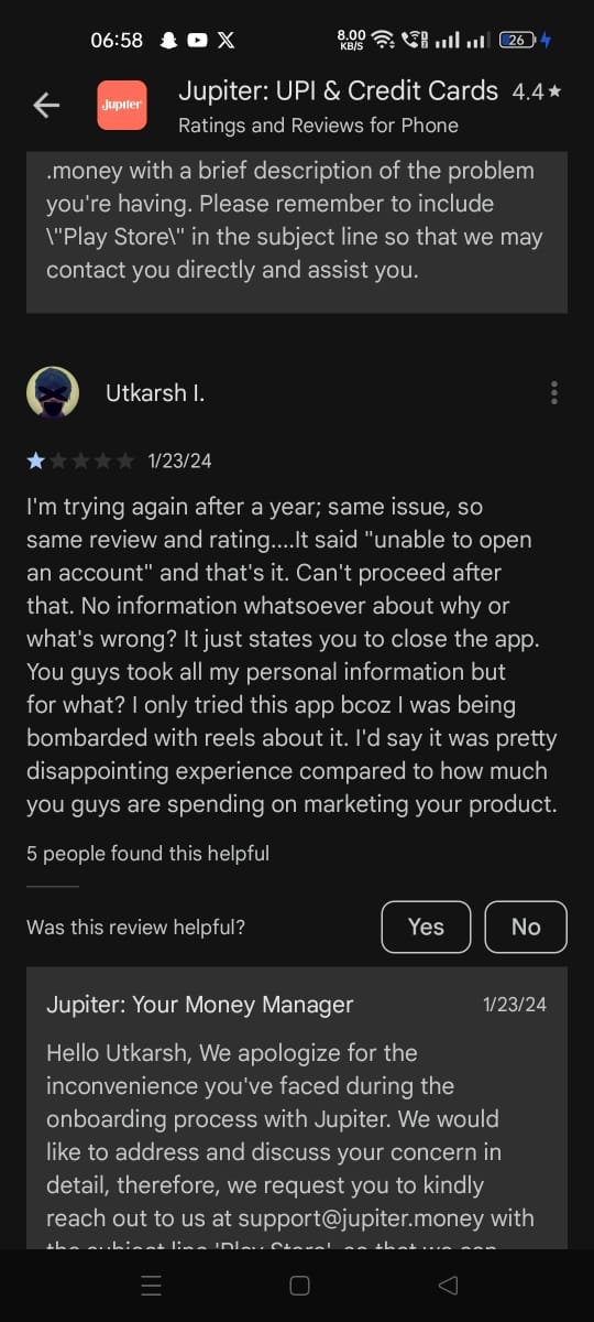
3. The onboarding experience for first-time users on the Jupiter app presents challenges due to a complex navigational structure. New users often find themselves disoriented and confused as they attempt to explore different features and functionalities. The lack of intuitive guidance during the initial interactions impedes users from seamlessly adapting to the app’s interface. This complexity undermines the app’s accessibility, hindering user engagement and satisfaction, especially during the crucial onboarding phase.
- To enhance the onboarding experience and simplify navigation for first-time users, Jupiter can introduce an interactive tutorial during the initial app launch. This tutorial should guide users through key features, demonstrate how to perform common tasks, and highlight the app’s unique functionalities. Integrating tooltips and contextual pop-ups can provide real-time guidance as users explore the interface. Additionally, incorporating a personalized onboarding checklist based on user preferences and financial goals can streamline the initial setup process, making it more intuitive and tailored to individual needs.
Summary:
The Jupiter app, designed for seamless money management, embarked on a transformative journey to enhance its user experience. Focused on addressing identified challenges through user-centric research, the case study illuminates the evolution of the app’s interface. From complex QR code positioning to limited insights from the expense tracker, each challenge was met with thoughtful solutions, aligned with the app’s core strengths. Introducing intuitive swiping for streamlined banking access, a centralized dashboard, and a transaction overview, Jupiter redefined convenience and efficiency. The case study reflects a commitment to user-centricity, ensuring a harmonious integration of user needs and the app’s unique features.